Constructing Dot Plots
A dot plot is a simple visual tool for representing data, where each dot corresponds to a specific data point.. It effectively displays frequency distributions, highlighting patterns, peaks, and left/right-skew. Dot plots are ideal for small to moderately sized datasets in various fields such as education, biology, and economics.
Dot Plots
How do I make a Dot Plot?
To create a dot plot by hand, follow these steps
- Draw a horizontal axis to represent the range of values, labeling it appropriately.
- Divide the axis into evenly spaced intervals to cover all data points.
- For each value in the dataset, place a dot above its corresponding position on the axis, stacking dots vertically for repeated values.
- Add a title and labels to clarify the data being represented.
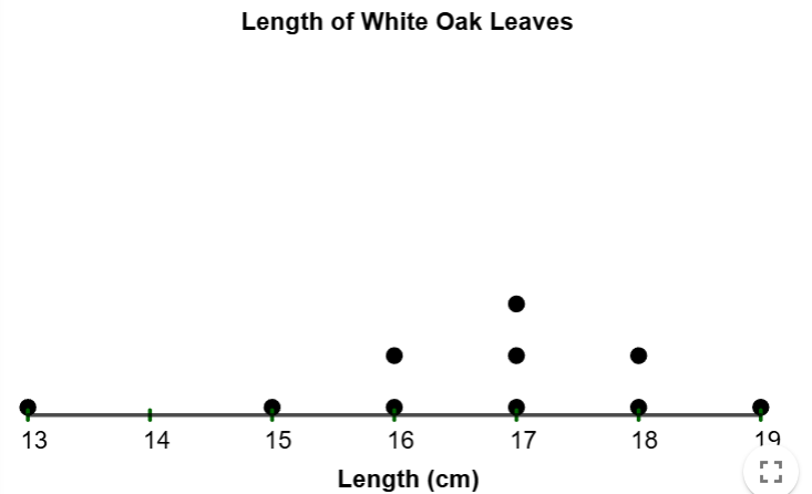
The following data represents the length in centimeters of a sample of 10 white oak leaves. Make a dotplot of this data.
| Length (cm) | |
|---|---|
| 17 | 18 |
| 18 | 15 |
| 13 | 19 |
| 16 | 17 |
| 17 | 16 |
Solution
First, we note that the range of values are from 13 to 19, so we label the \(x\)-from 13
to
19. Since 13 only appears once, we will put one dot above 13.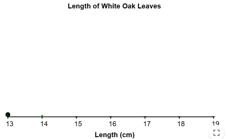
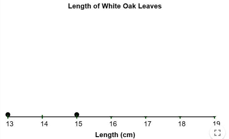
Next, since 15 only appears once, we will put one dot above
15.
Next, since 16 appears twice, we will put two dots
above 16.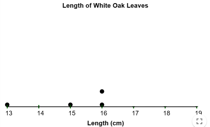
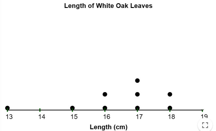
Next, since 17 appears 3 times, we will put three dots above
17.
Next, since 18 appears 2 times, we will put two dots above
18.
Finally, since 19 appears once and is the largest data point,
we
will add a dot above 19, and that completes the dotplot.
$$\tag*{\(\blacksquare\)}$$
Of course, when doing anything by hand, this introduces human error. Like with our other displays, we will use GeoGebra to construct our Dot Plots. In this case, we will use the Dot Plot Generator Tool. Let's use the tool on our next example.
Example 2
A customer service manager wants to evaluate the team's efficiency in responding to support
tickets during peak hours. The response times (in minutes) for 10 randomly selected tickets
are
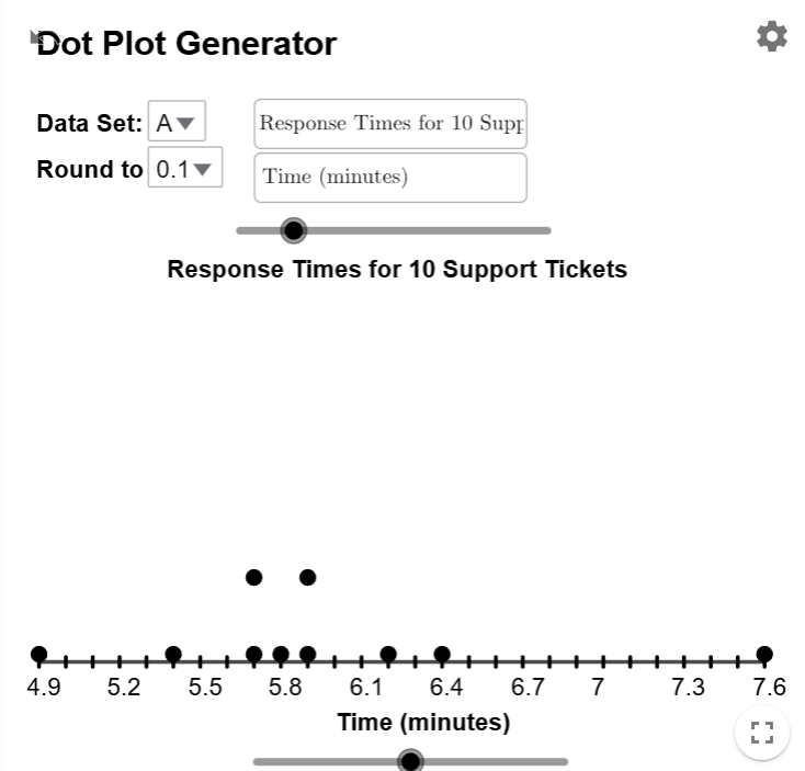
given in the table below. Make a dot plot of this data.
| Response Time (minutes) | |
|---|---|
| 5.9 | 5.7 |
| 4.9 | 5.8 |
| 7.6 | 6.2 |
| 6.4 | 5.7 |
| 5.4 | 5.9 |
Solution
Download the data and enter it into the Dot Plot Generator Tool. Close the Spreadsheet Tab, and notice that the tool has already put the dots on the graph for you.
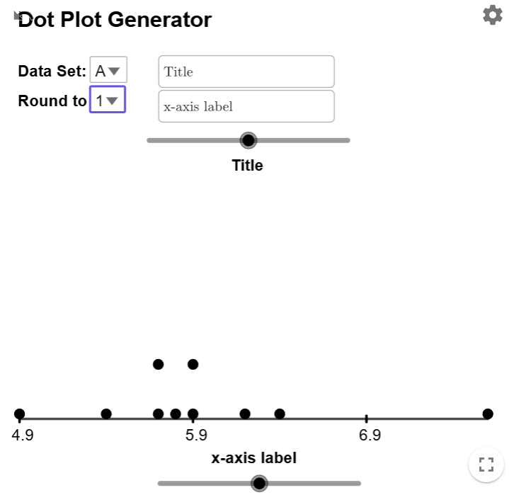
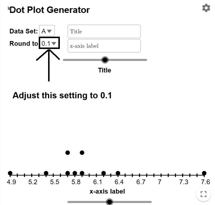
The dots are correctly placed, but the \(x\)-axis labels start at 4.9 and increase by 1. This happens because the Dot Plot Generator defaults to integers. Since the data is rounded to one decimal place, select \(0.1\) from the dropdown menu. (Note: Due to an unresolved bug, \(0.1\) appears as \(1/10\).) Adjusting this fixes the \(x\)-scale, making all ticks and labels display correctly.
Title your Dot Plot and \(x\)-axis, and your graph is done.
$$\tag*{\(\blacksquare\)}$$
Interpreting Dot Plots
Dot plots give us another way to see the shape of the distribution. But unlike histograms, it gives us a way to identity the exact data points that are either unusually small or unusually large compared to the other data points.
If we look at the dot plot for and draw a curve over it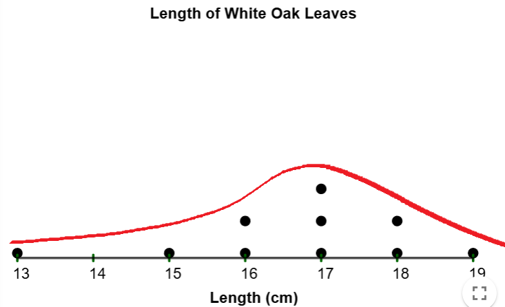
we see that since 13 is smaller
than the rest of the data
clustered around the peak at 17, and this unusually small data point skews the distribution
to
the left by elongating the left tail.
Similarly, if we draw a curve over the dot plot for example 2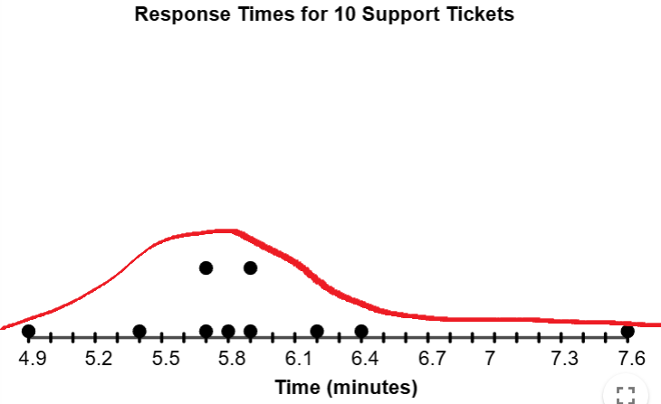
we see that since 7.8 is larger
than the rest of the data
clustered around the peak approximately 5.6-5.9, and this unusually large data point skews
the
distribution to the right by elongating the left right.
Note
We will formally introduce the criteria for when a data point is significantly small or significantly large later in this course.